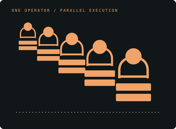
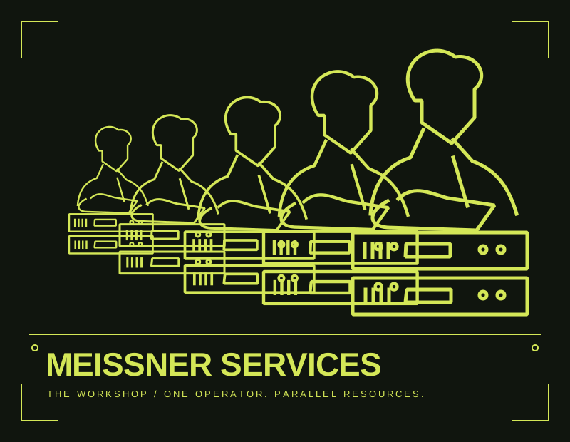
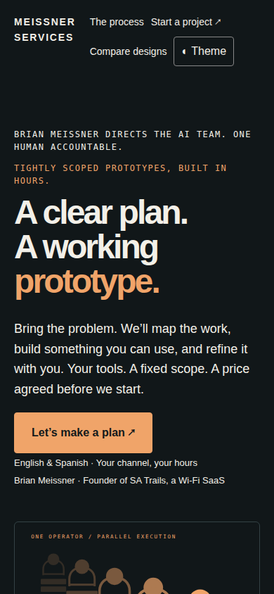
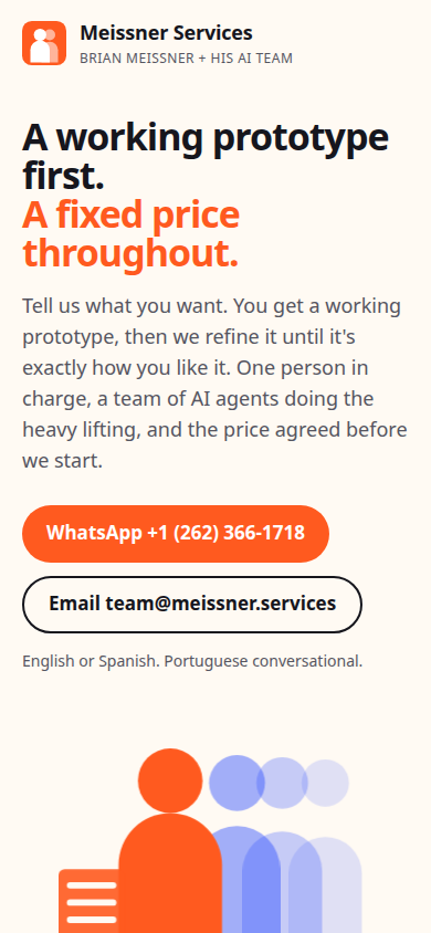
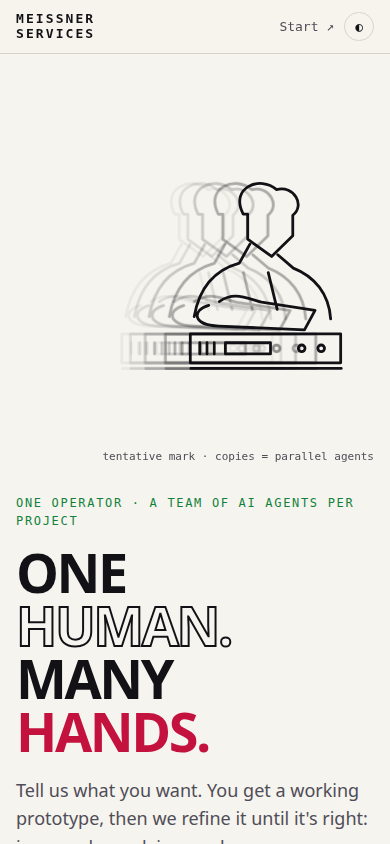
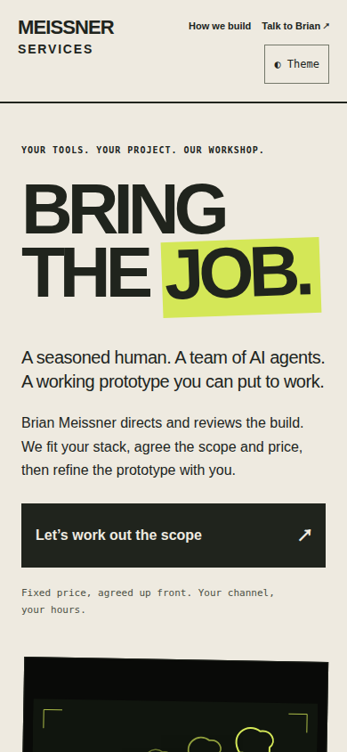
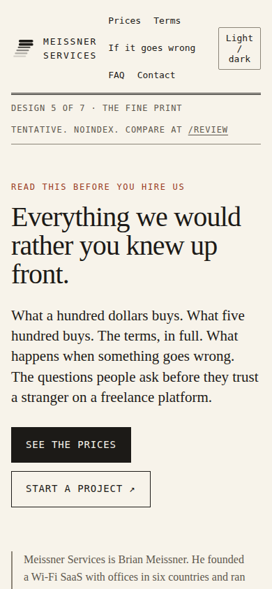
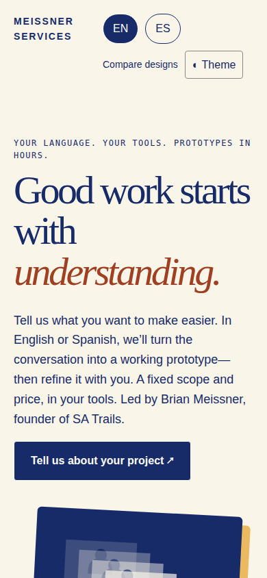
36 captured references: 27 service businesses matching the brief, plus 9 product and publishing references. Screenshots are research evidence, not assets used in the marketing pages.
Browse all 36 references
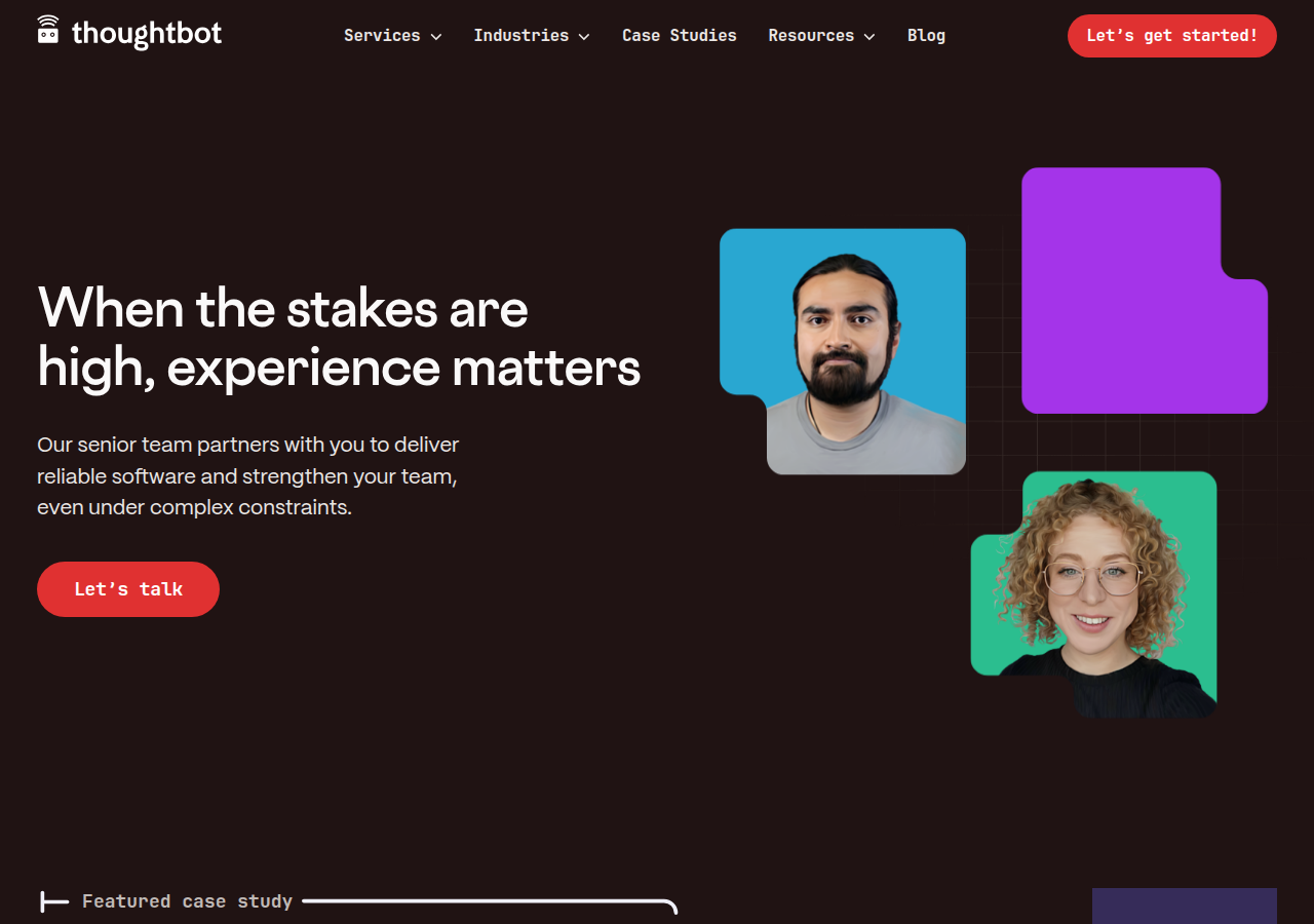
Hero pairs a plain promise ('When the stakes are high, experience matters') with one red CTA ('Let's talk'): one-promise-one-action above the fold.
Open research screenshot ↗
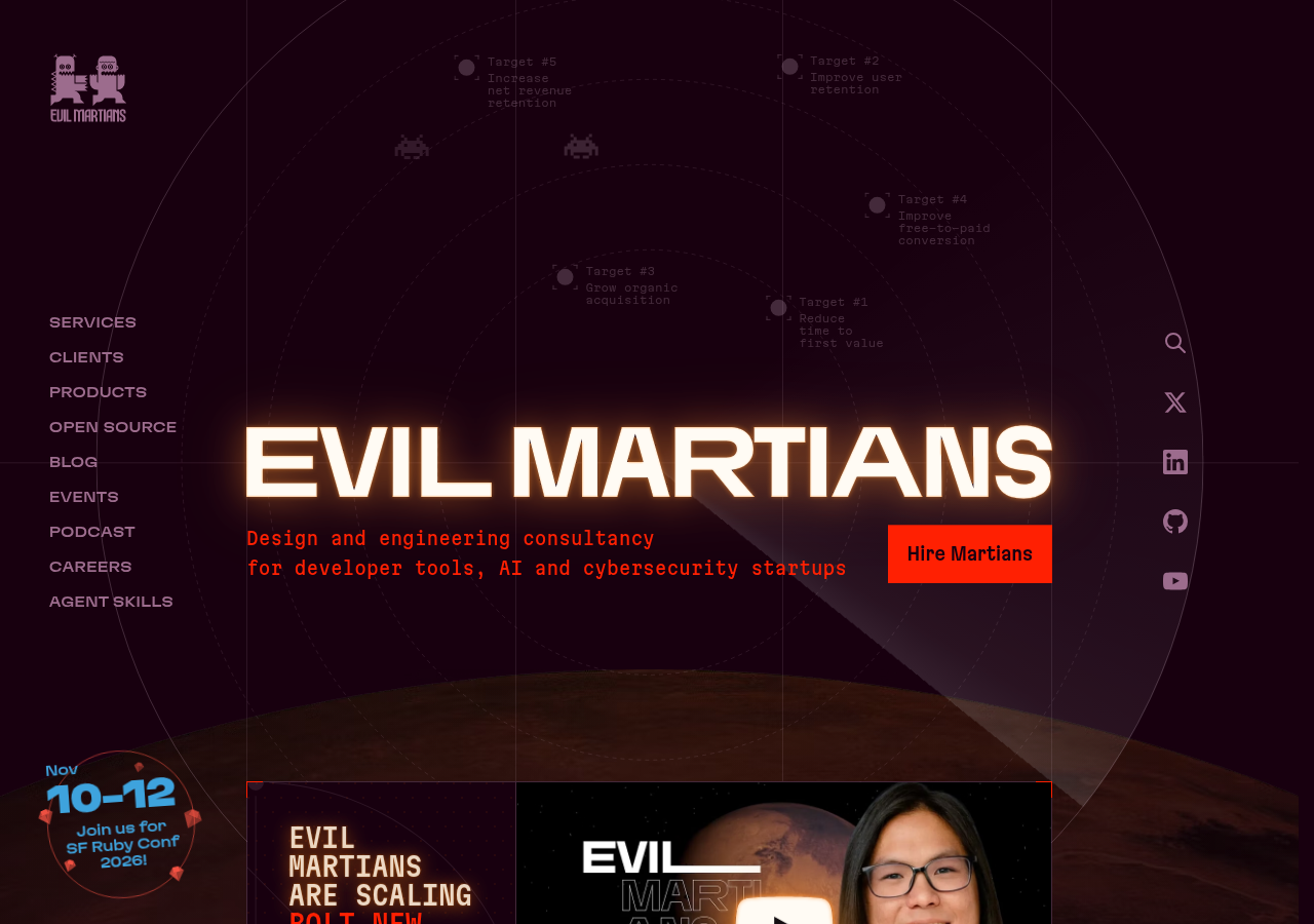
Bold retro wordmark glow + monospace sub-line naming exactly who they serve; terminal-flavoured annotations floating in the hero.
Open research screenshot ↗
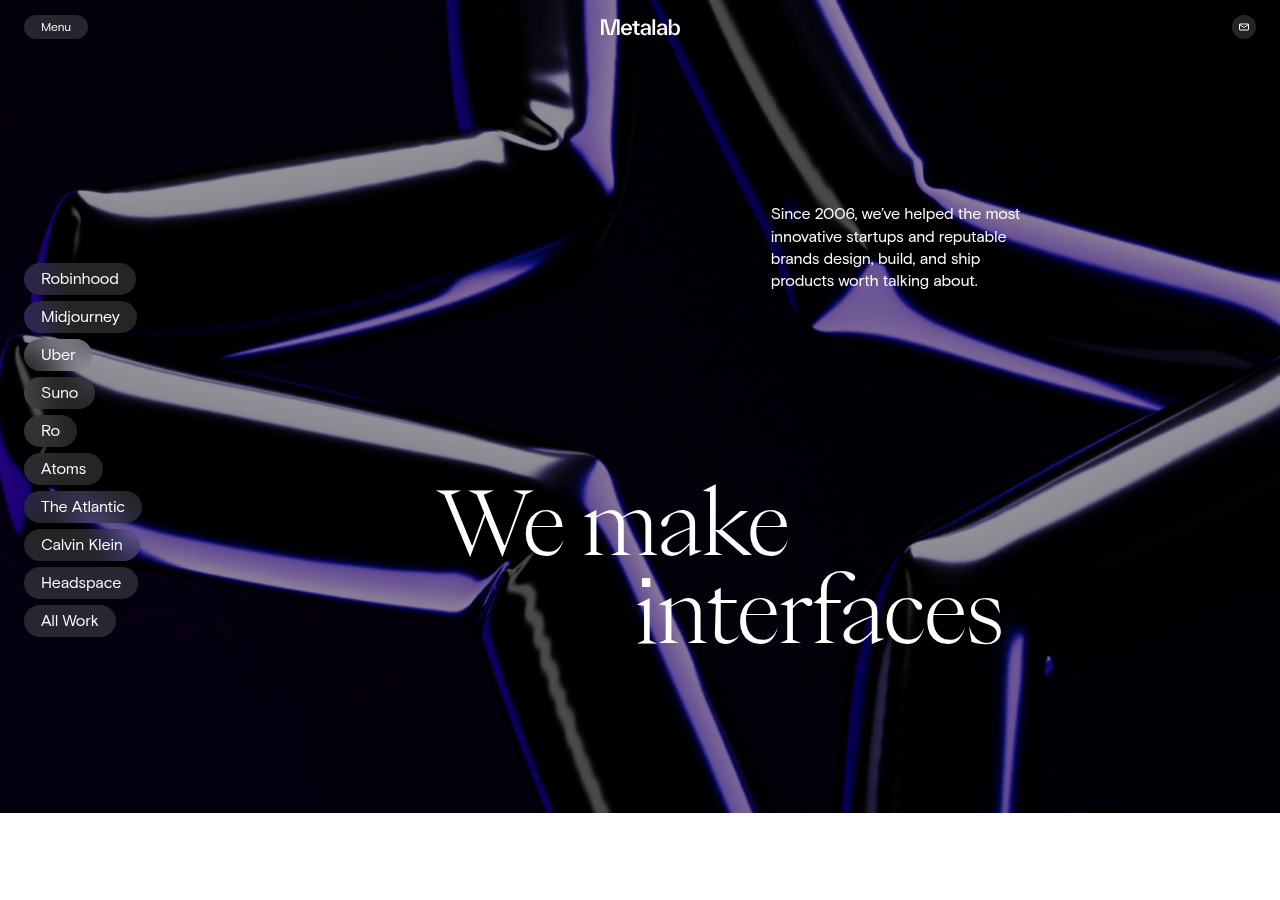
Single big serif statement over a dark motion object, with work list as small pills on the left: confident minimalism + motion.
Open research screenshot ↗
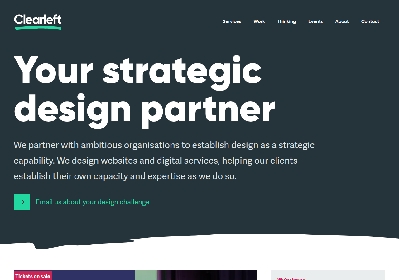
Headline + one-sentence positioning + a single 'Email us about your design challenge' mailto CTA: contact as the primary action.
Open research screenshot ↗
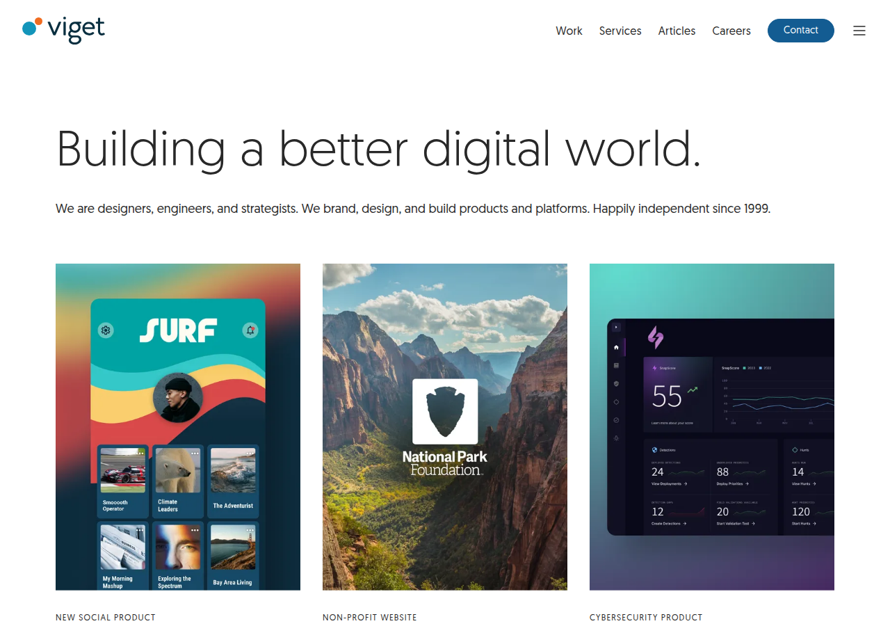
'Building a better digital world.' + one line of who/what + 'independent since 1999': plain-spoken credibility without hype.
Open research screenshot ↗
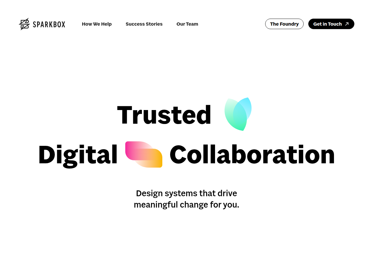
Huge centered type with inline colour shapes ('Trusted ◆ Digital ▬ Collaboration'): playful typographic hero without photos.
Open research screenshot ↗
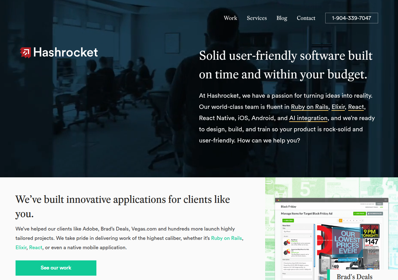
Promise names the client's fear directly: 'built on time and within your budget', plus visible phone number in the nav.
Open research screenshot ↗
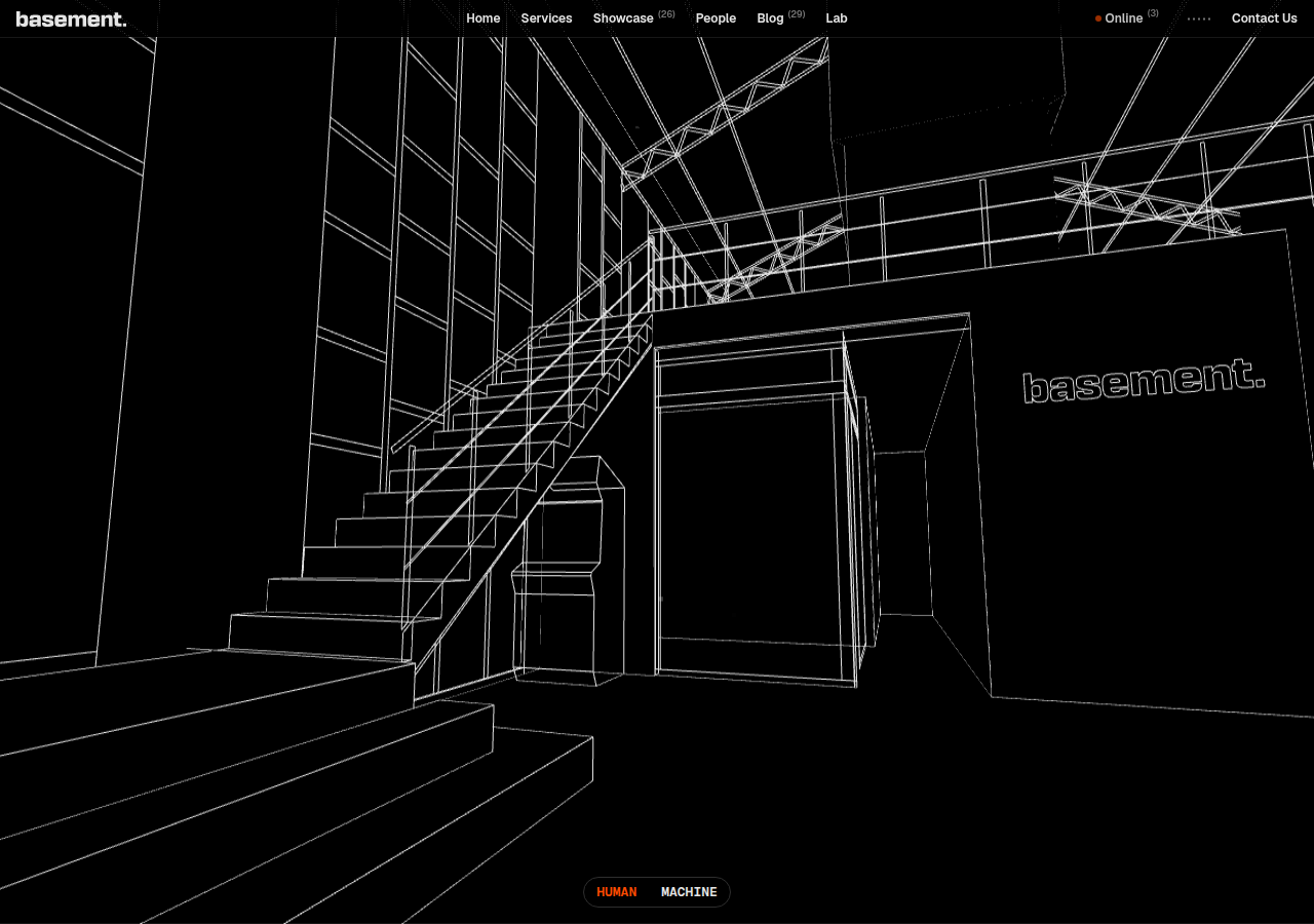
Wireframe 3D line-art hero with a HUMAN/MACHINE toggle at the bottom: line art echoes our logo style; toggle idea = human+agents.
Open research screenshot ↗
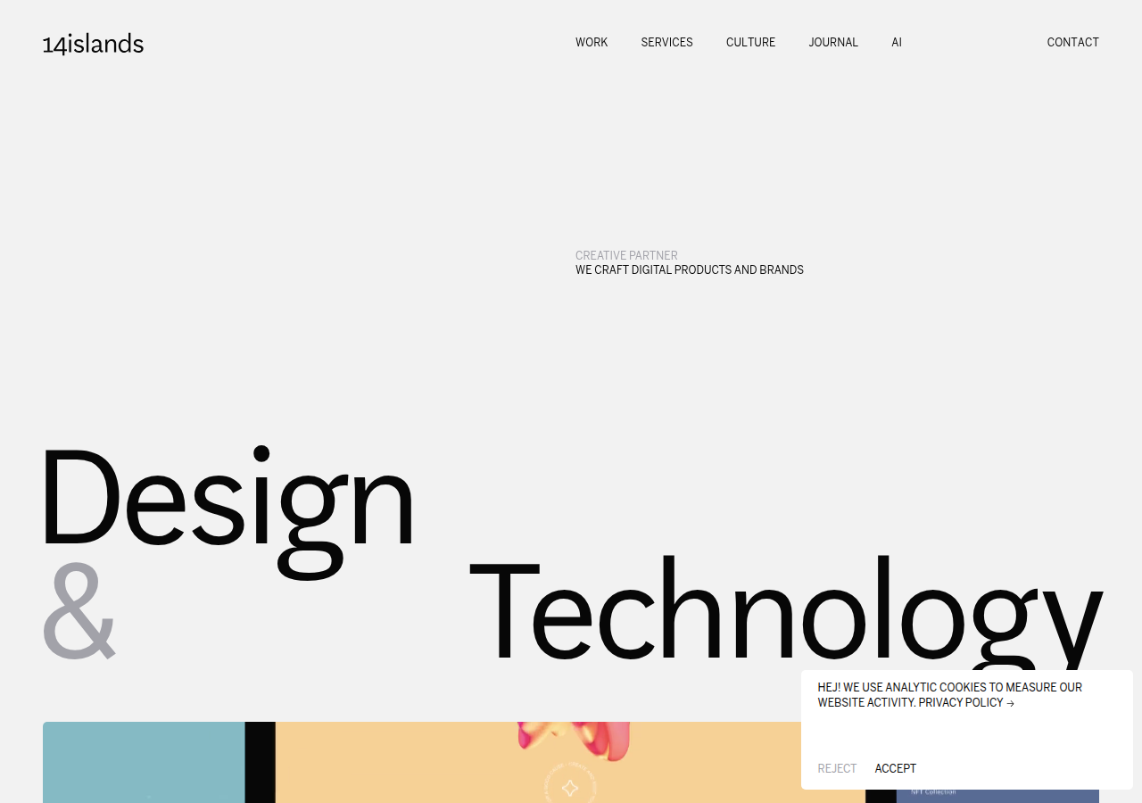
Oversized split typography ('Design & Technology') with generous whitespace: editorial calm.
Open research screenshot ↗
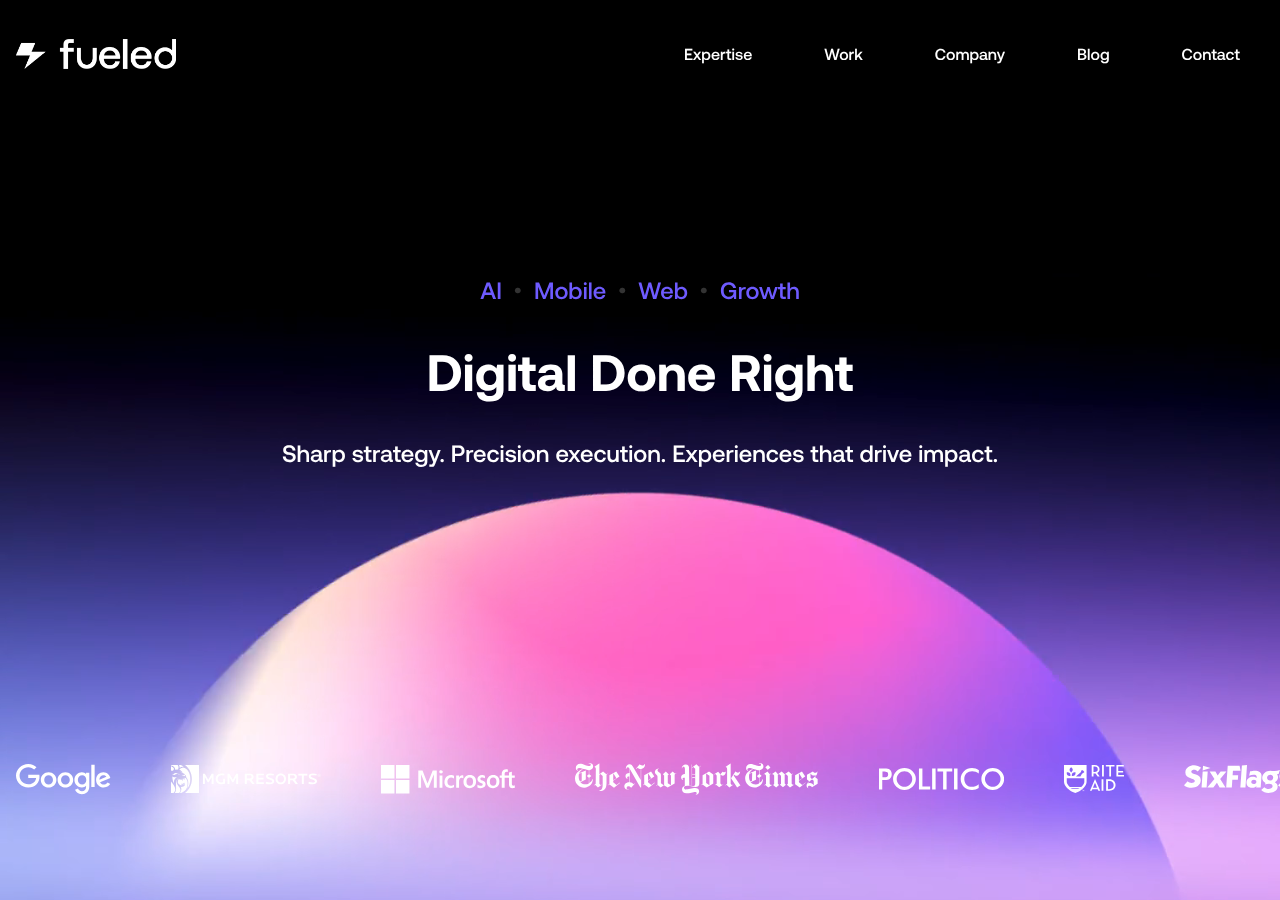
Category chips above headline (AI · Mobile · Web · Growth) then a 3-word promise: instant scannable scope.
Open research screenshot ↗
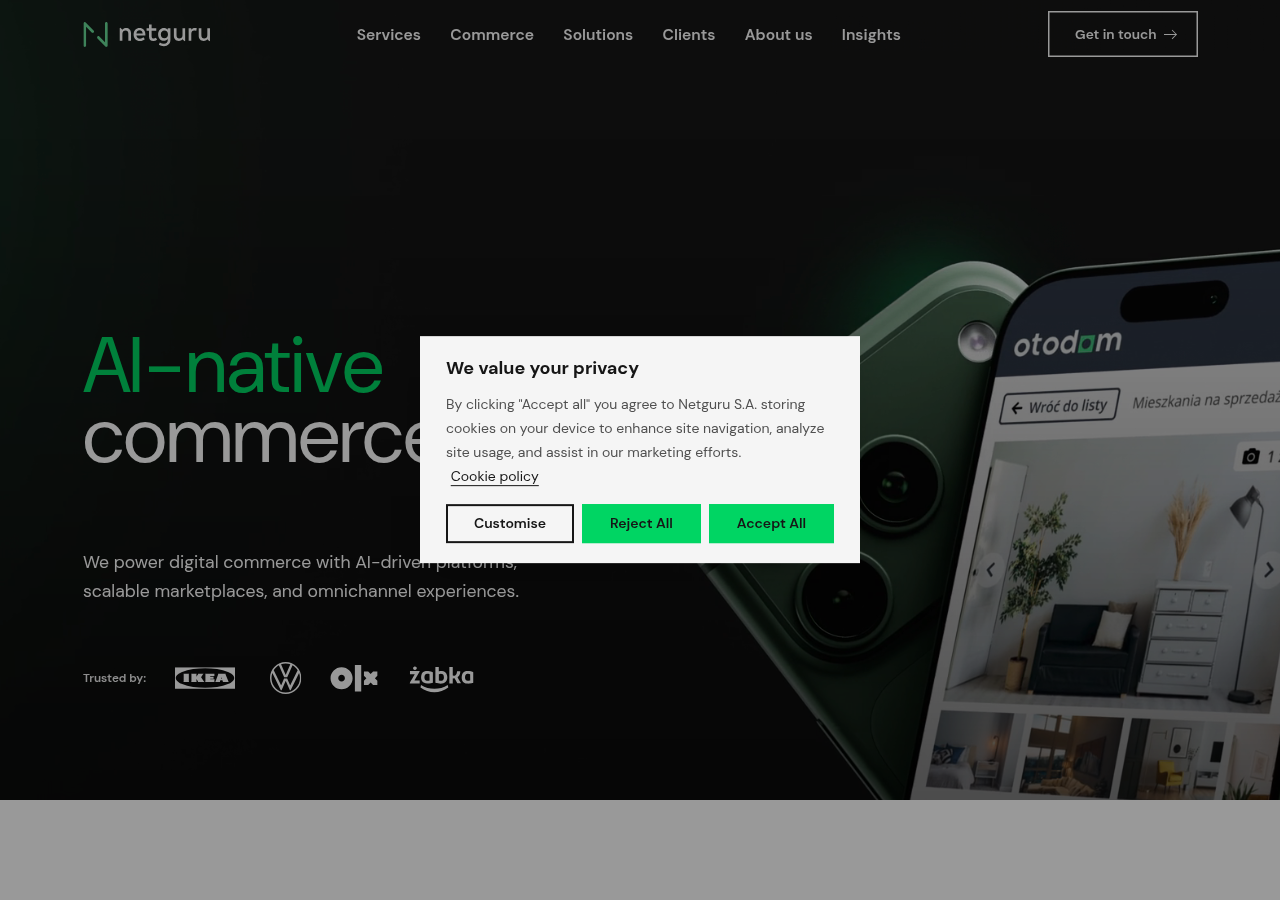
Dark hero, coloured keyword in the headline ('AI-native commerce'), product mock bleeding off the edge.
Open research screenshot ↗
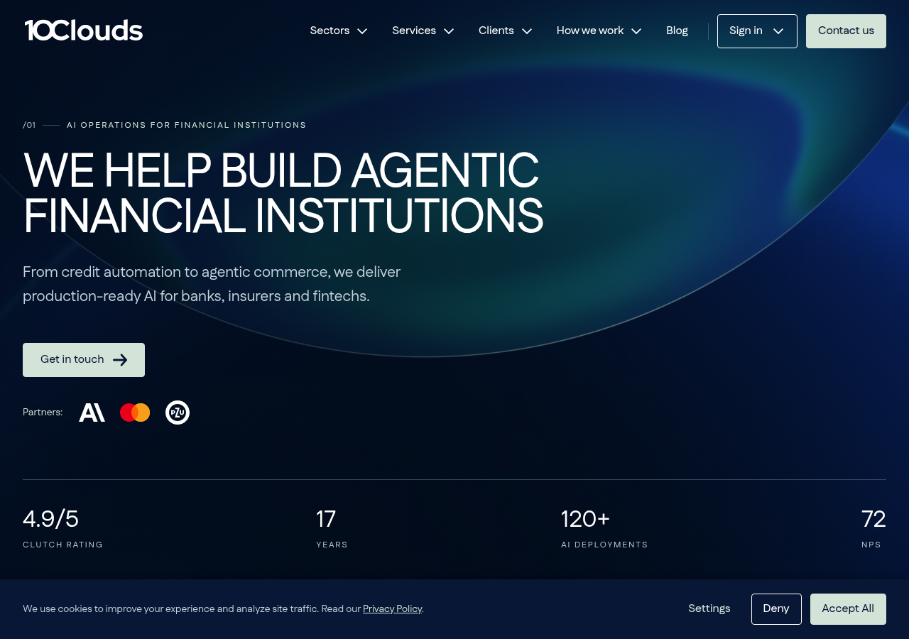
Small numbered eyebrow ('/01 AI OPERATIONS FOR…') above an uppercase headline: section-numbering system we can reuse for element IDs.
Open research screenshot ↗
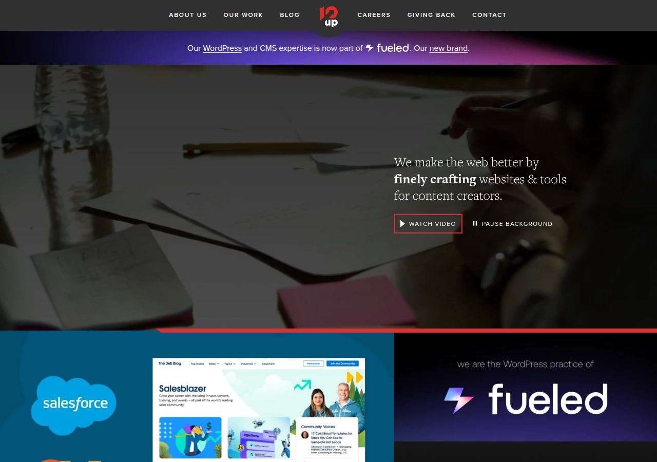
Background video with an explicit 'PAUSE BACKGROUND' control: accessible motion done right.
Open research screenshot ↗
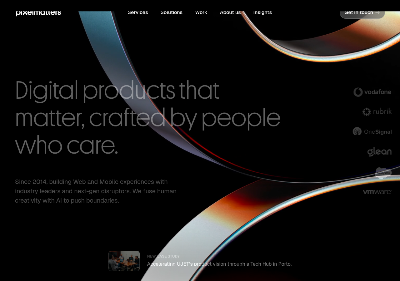
Light-ray swoosh over dark with thin large type: premium feel from one abstract shape, no photos.
Open research screenshot ↗
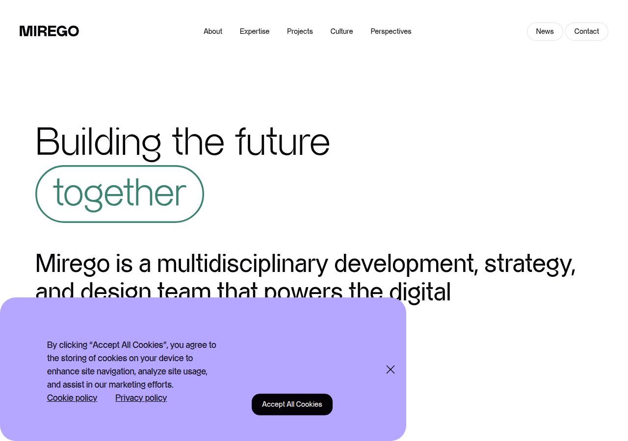
Outlined-pill highlight on one word ('together') inside a big headline: emphasis without colour noise.
Open research screenshot ↗
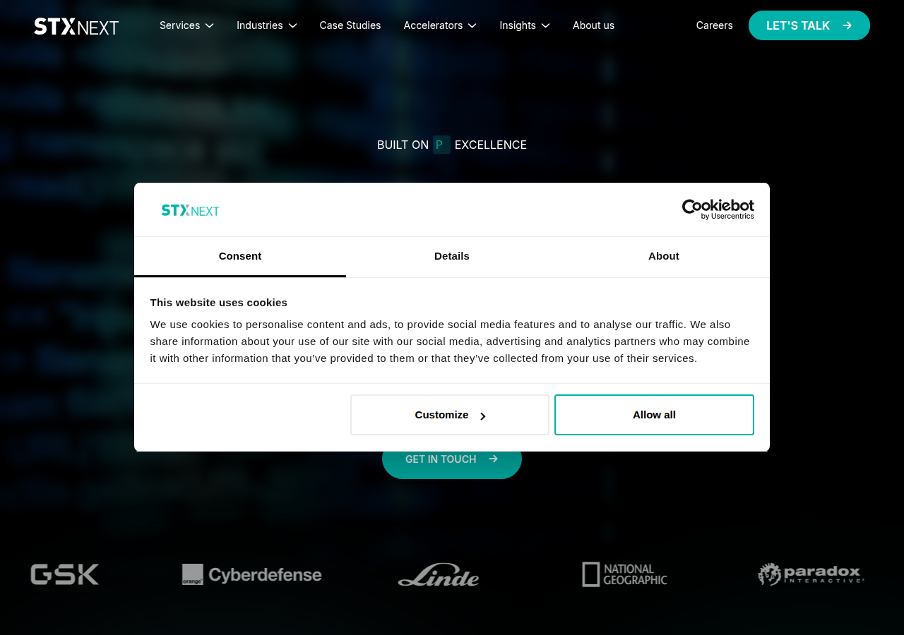
Single 'LET'S TALK' pill CTA repeated in nav and hero: consistent conversion target.
Open research screenshot ↗
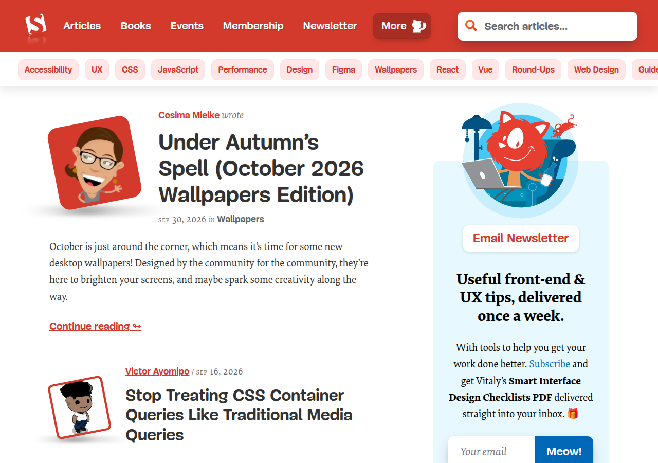
Friendly illustrated avatars and tag chips: warmth through illustration instead of stock photos (we must not use fake-people images).
Open research screenshot ↗
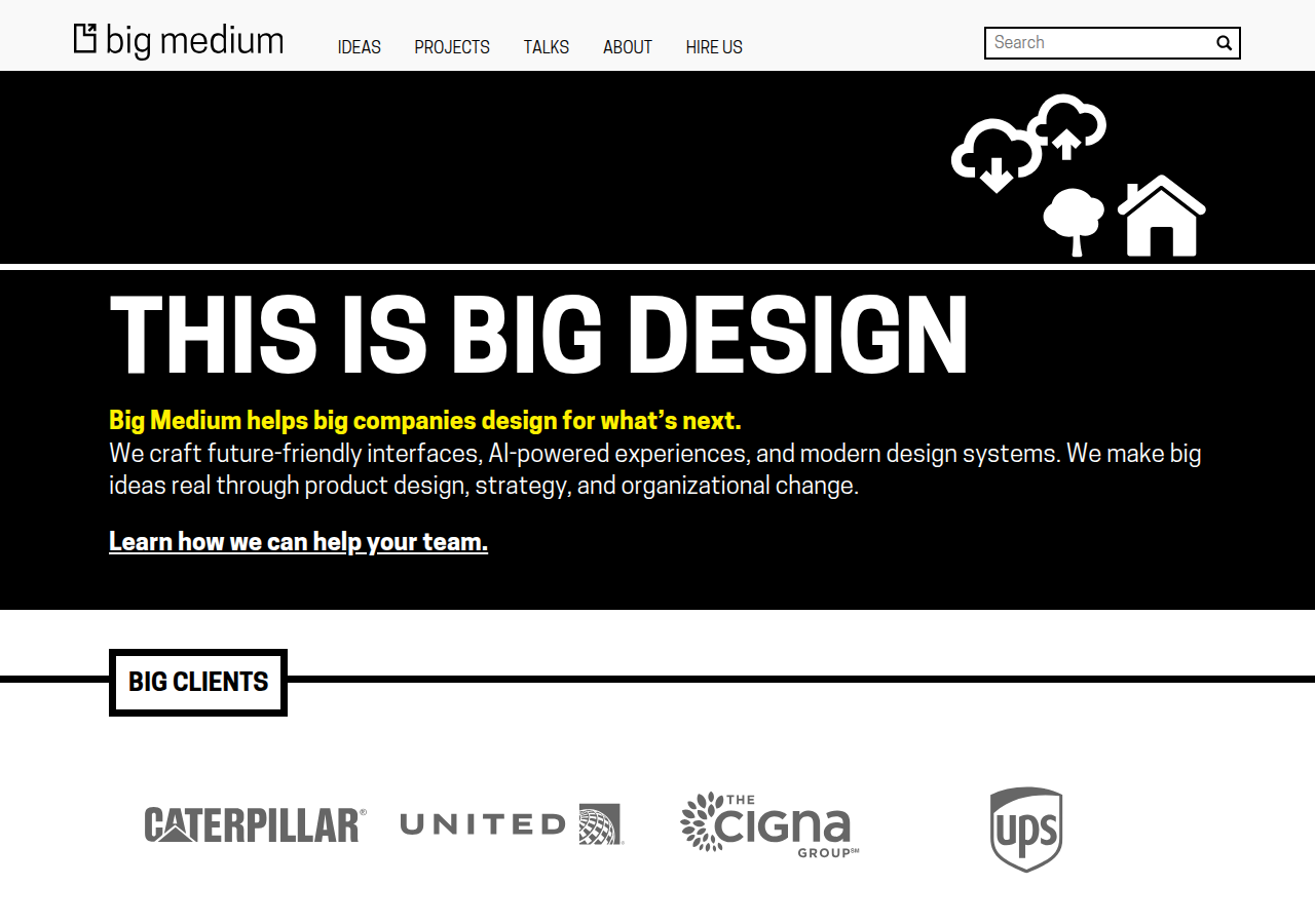
Brutalist black/white blocks with thick rules and a framed section label ('BIG CLIENTS'): strong section framing (we'd frame 'TOOLS WE WORK IN', never clients).
Open research screenshot ↗
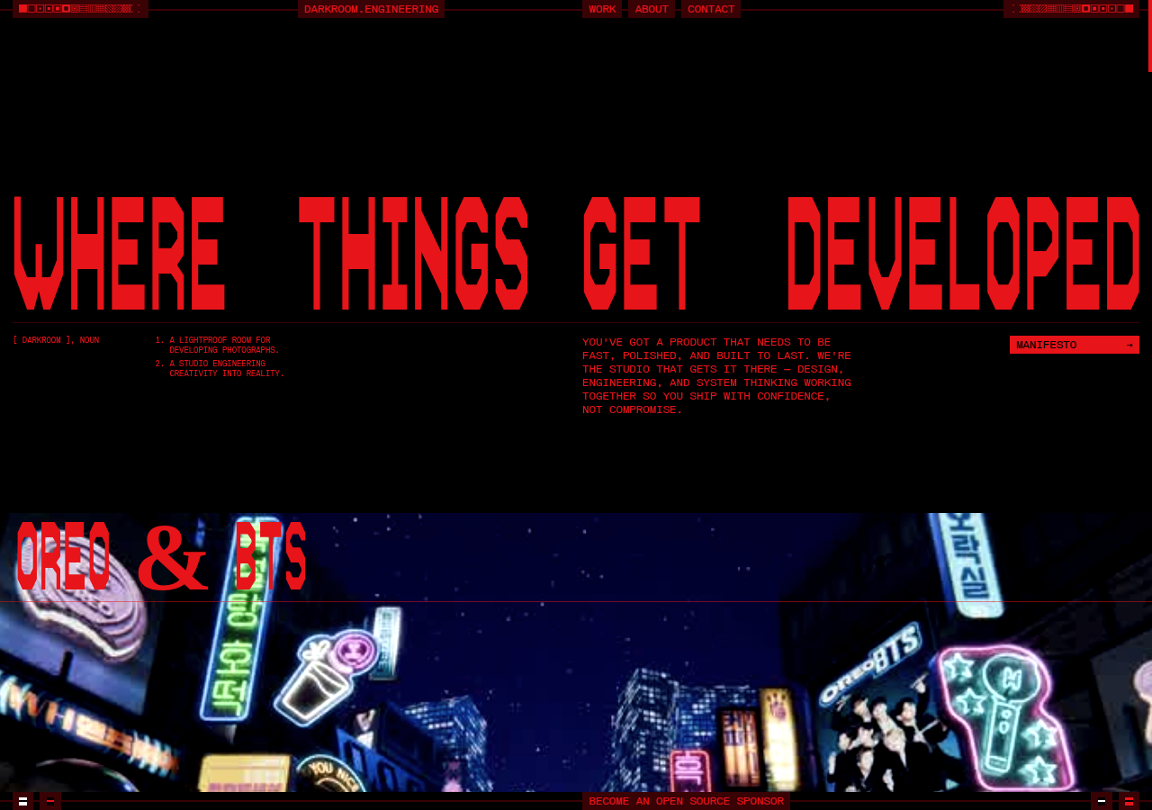
Loud red-on-black condensed display type + tiny mono annotations: maximal Wild Card energy.
Open research screenshot ↗
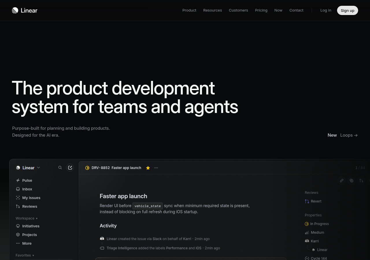
Hero shows the real product UI (issue view with live activity feed) as the proof: our analogue is an illustrative agent console.
Open research screenshot ↗
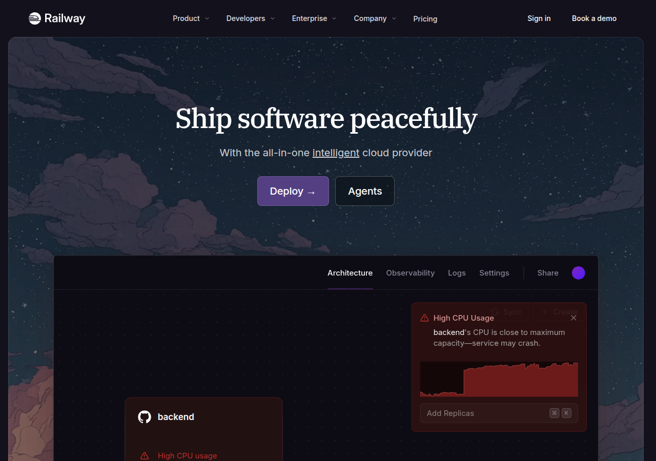
Dark scenic hero with an embedded app panel showing an alert and graph: 'live-feeling' system panel inside marketing.
Open research screenshot ↗
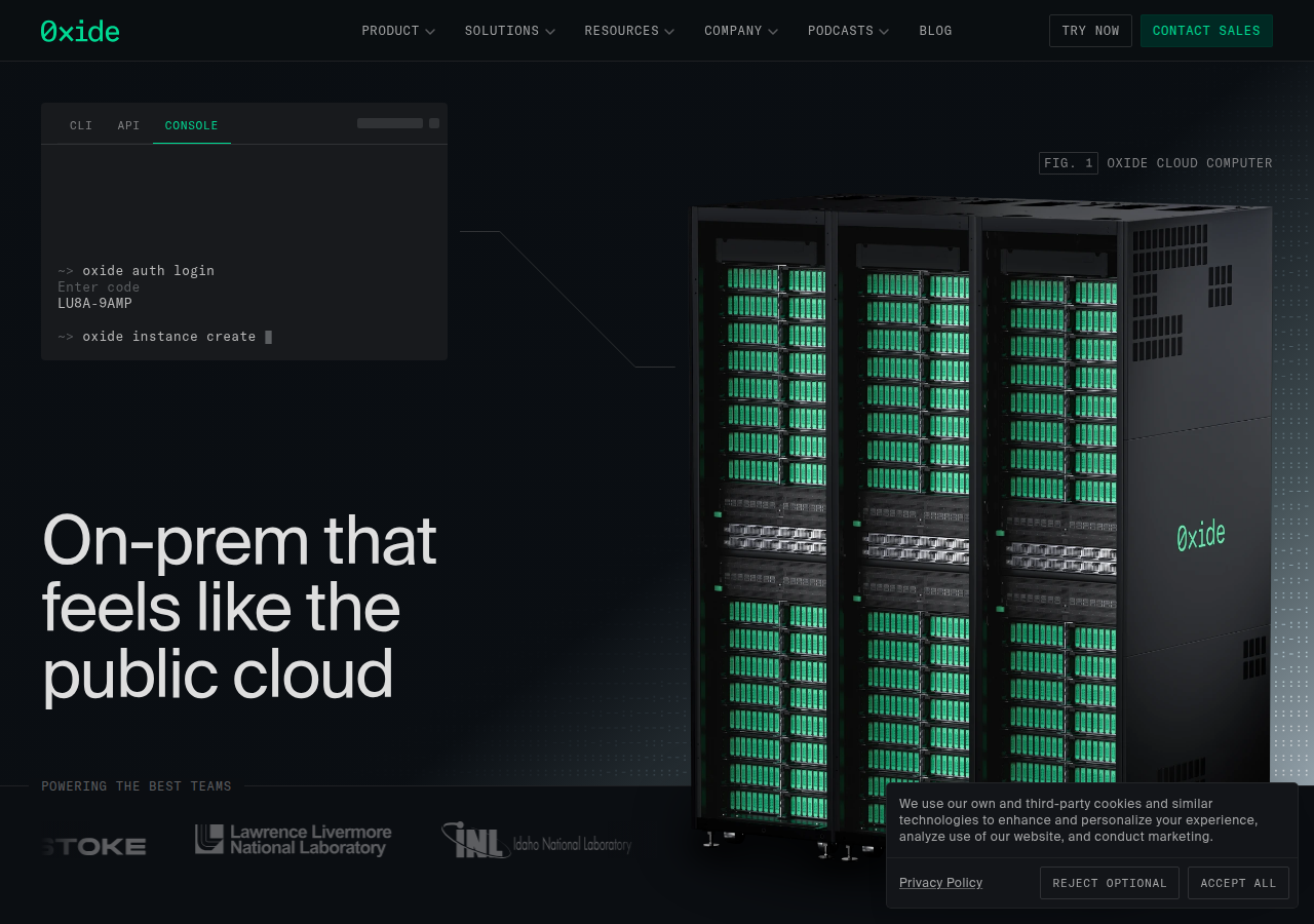
CLI/API/CONSOLE tabbed terminal snippet beside server-rack art labelled 'FIG. 1': engineering-drawing labels fit our server-stack logo.
Open research screenshot ↗
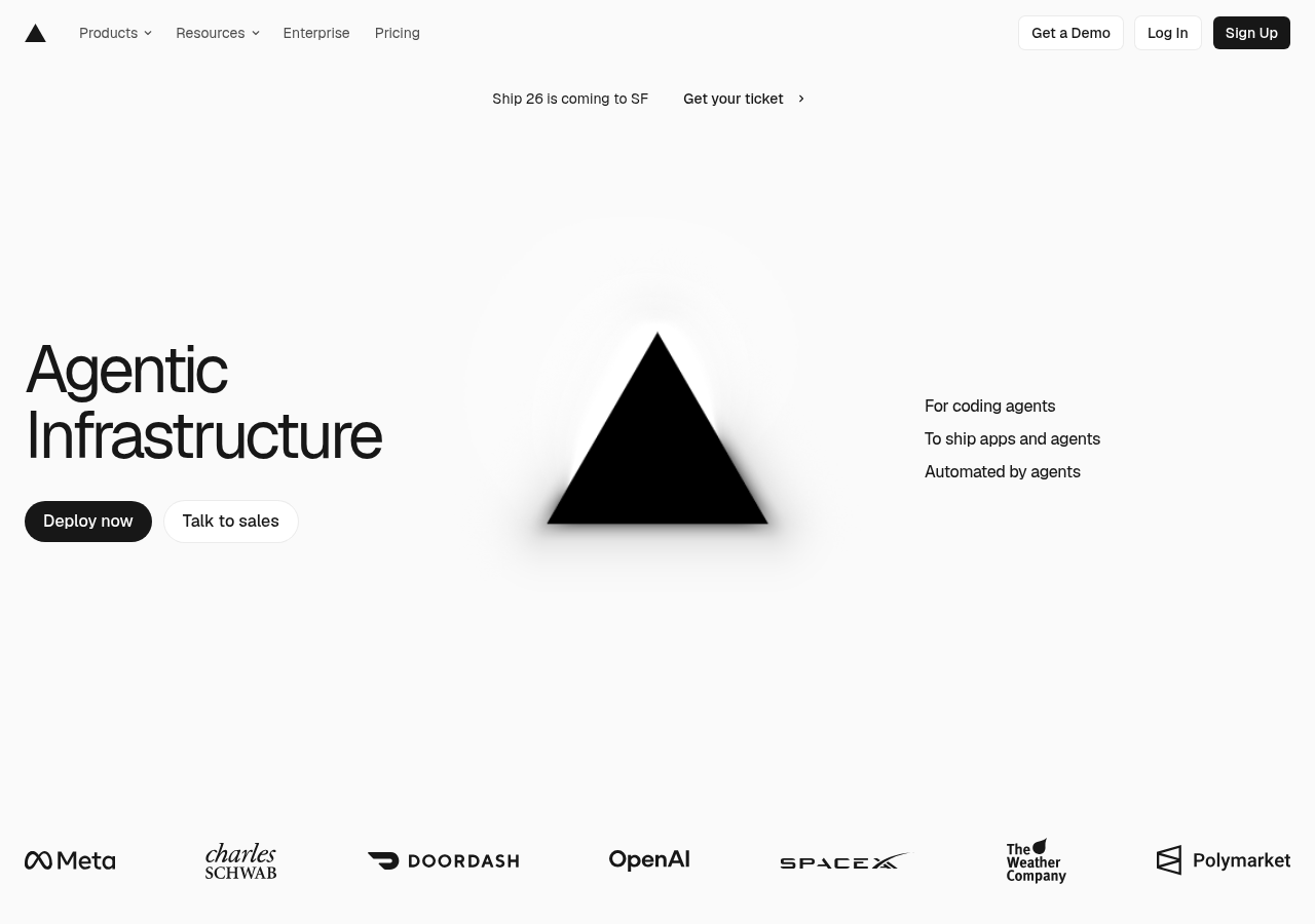
Centered geometric mark with three short capability lines to the side ('For coding agents / To ship apps and agents / Automated by agents').
Open research screenshot ↗
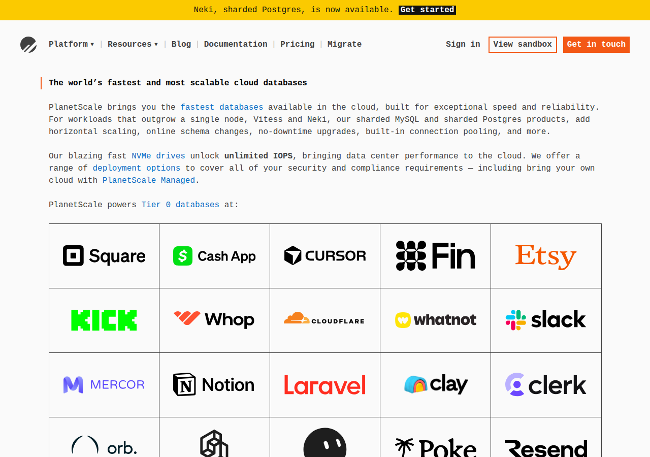
Monospace body text and a dense logo grid: developer-native tone; grid pattern reusable for 'tools we work in' wall.
Open research screenshot ↗
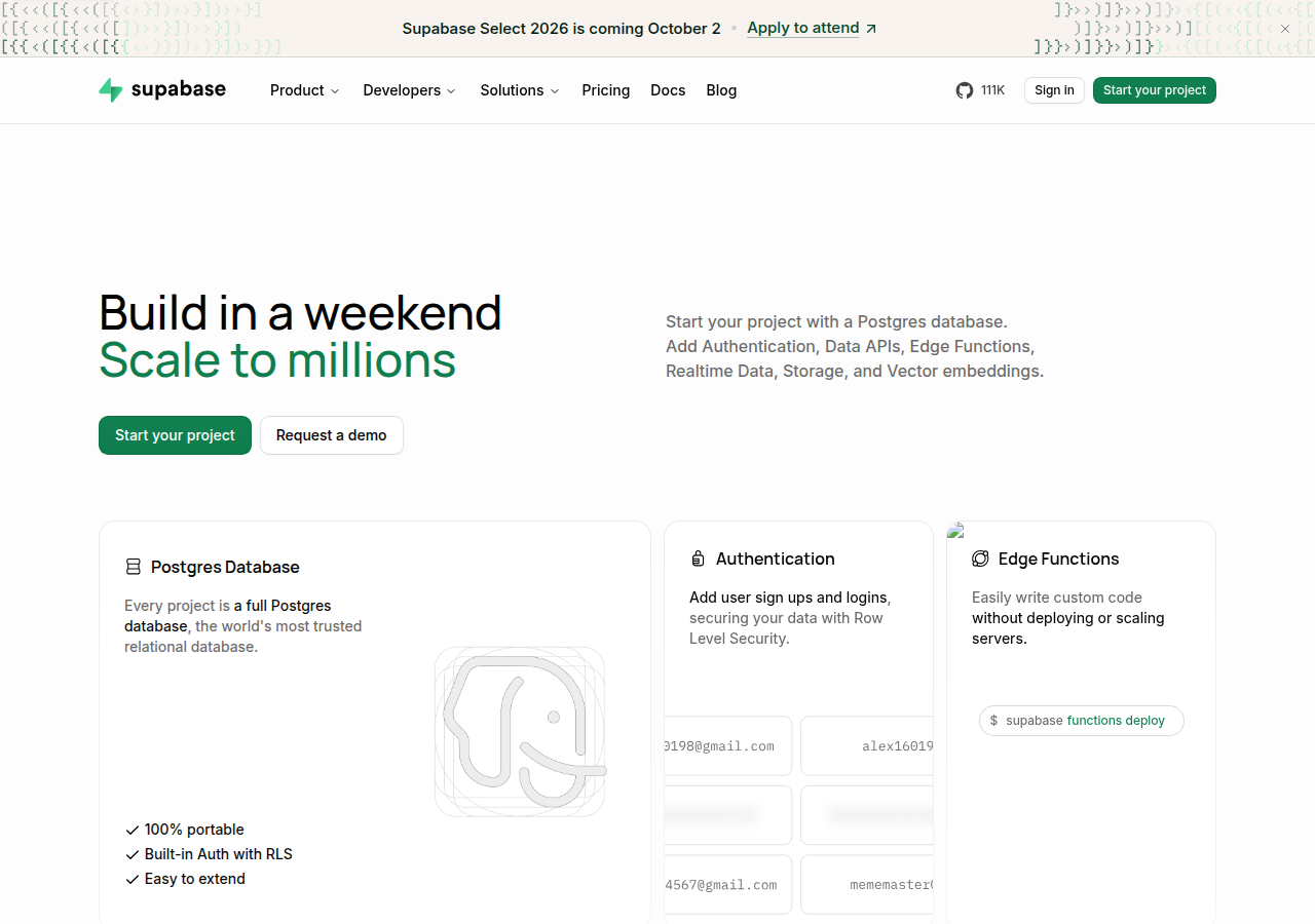
'Build in a weekend / Scale to millions' two-line promise, feature cards with tiny code/UI fragments.
Open research screenshot ↗
cal — product
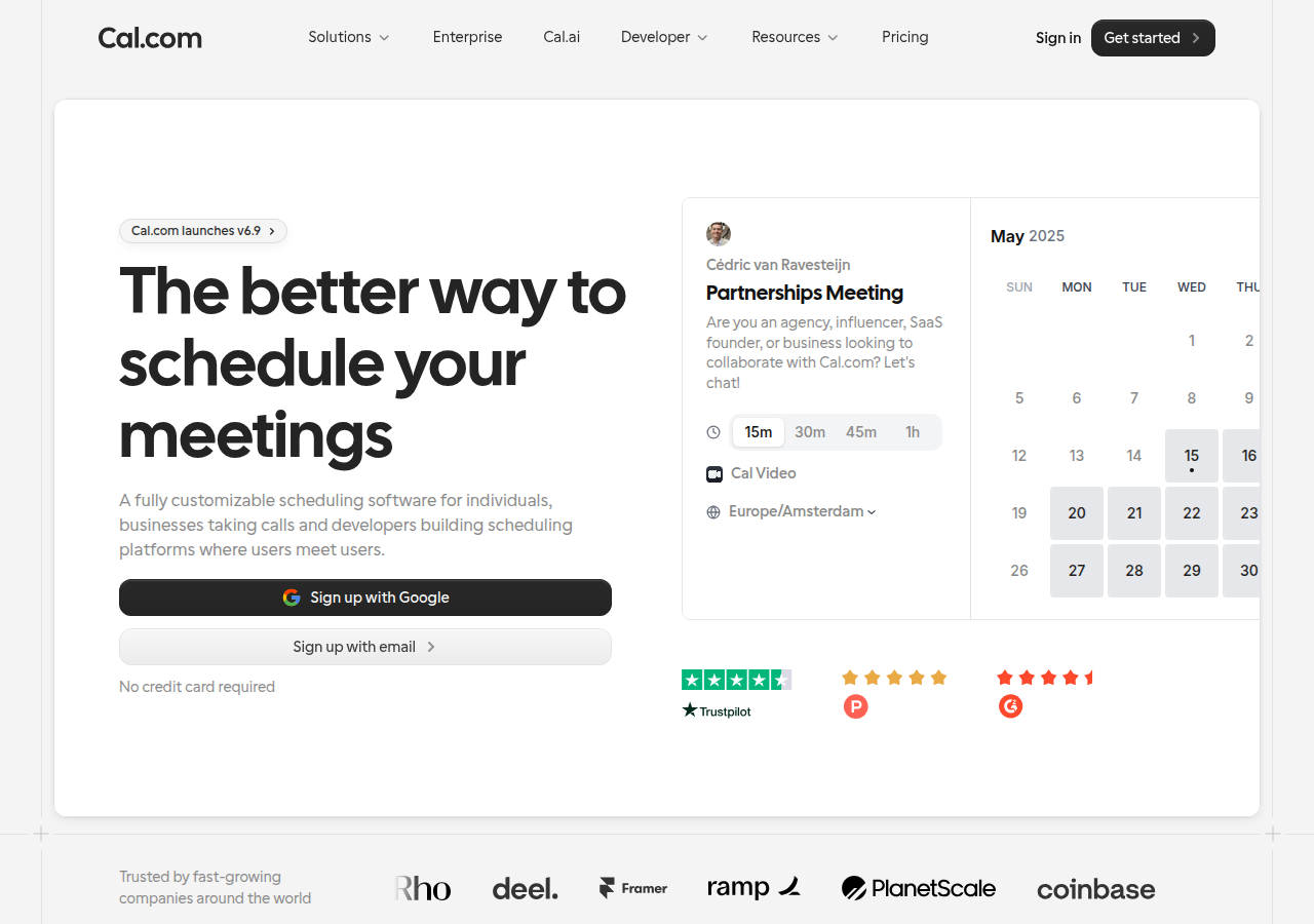
Interactive booking widget embedded in the hero: the contact action is the hero (our version: WhatsApp/email picker).
Open research screenshot ↗
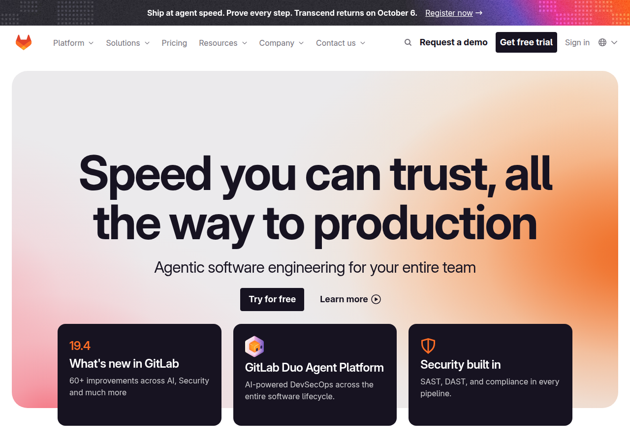
'Agentic software engineering for your entire team' sub-line + three dark capability cards under the hero.
Open research screenshot ↗
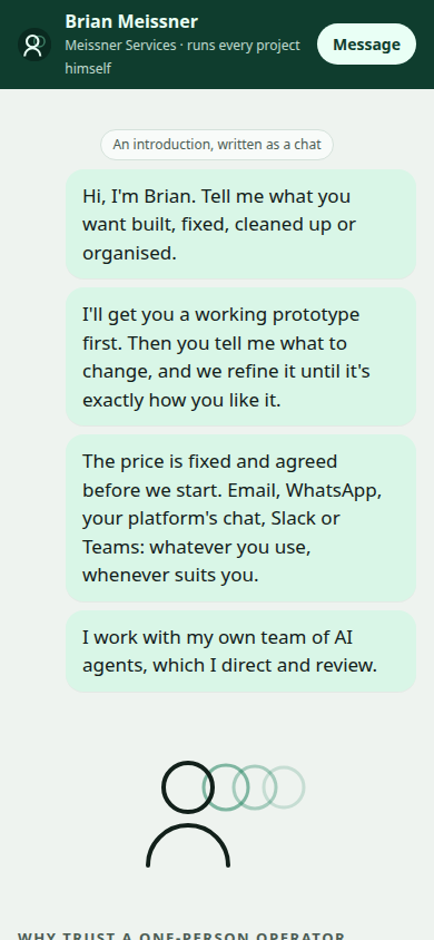
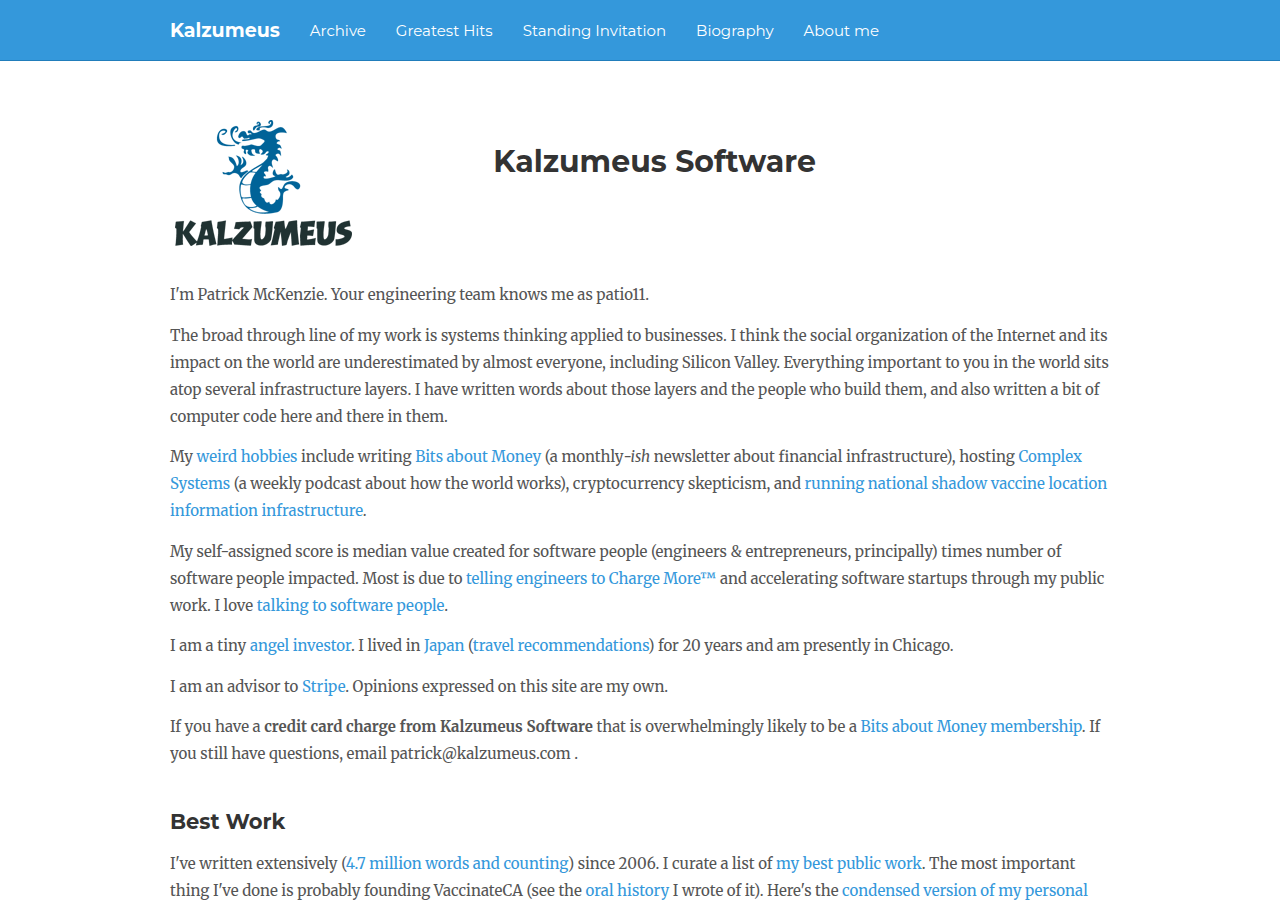
Solo operator site in first person, plain text, explicit 'email me' and honest scope: founder voice as the trust signal.
Open research screenshot ↗
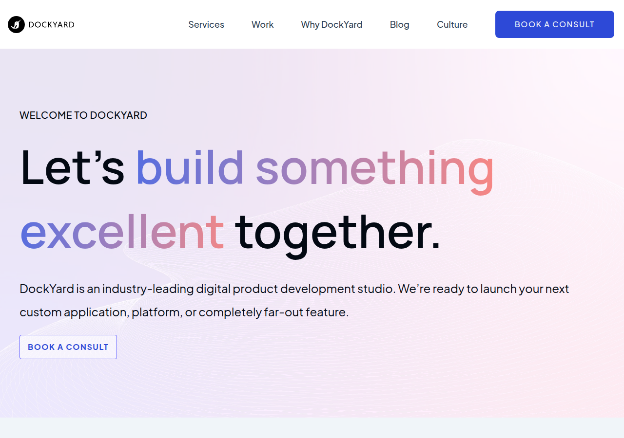
Gradient-highlighted words inside a friendly headline ('Let's build something excellent together') + 'BOOK A CONSULT' repeated in nav and hero.
Open research screenshot ↗
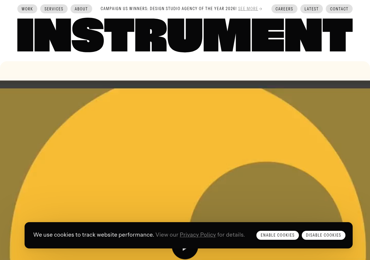
Full-bleed giant wordmark as the header itself, pill nav chips above: the name IS the hero.
Open research screenshot ↗
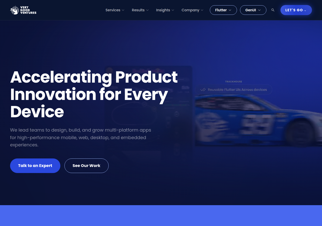
Dark blue hero with product UI ghosted behind copy, twin CTAs 'Talk to an Expert' / 'See Our Work'.
Open research screenshot ↗
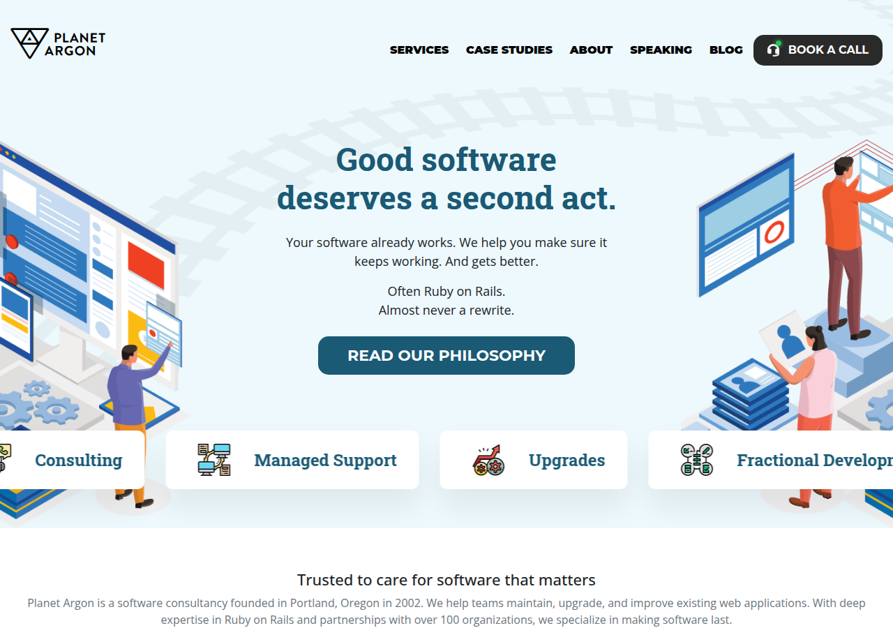
Plain-spoken positioning ('Good software deserves a second act... Almost never a rewrite.') + service tiles (Consulting, Managed Support, Upgrades) as scannable offers.
Open research screenshot ↗
rangle — consultancy
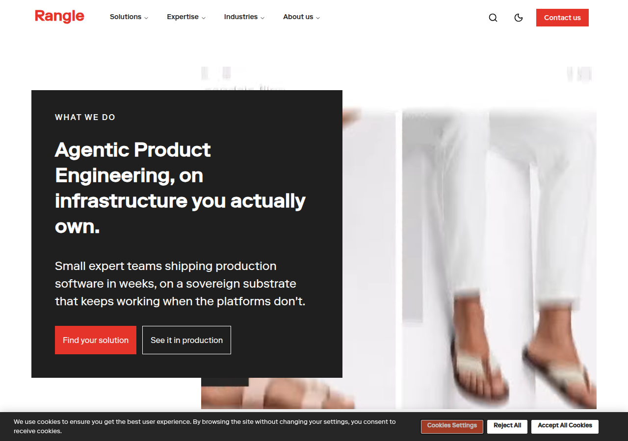
Dark text card over imagery: 'WHAT WE DO' eyebrow, one paragraph, two CTAs; plus explicit 'infrastructure you actually own' (matches our 'you own everything').
Open research screenshot ↗
xteam — dev shop
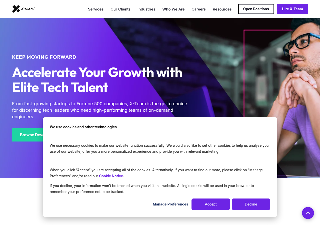
Eyebrow 'KEEP MOVING FORWARD' + bold two-line value prop + single green CTA: momentum framing for capacity buyers (our agencies/freelancers audience).
Open research screenshot ↗
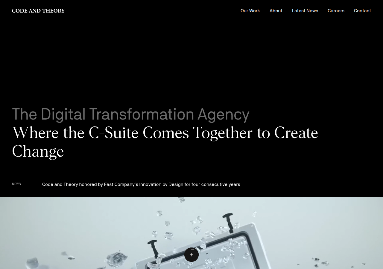
Serif headline on pure black with a single news line: restraint and confidence.
Open research screenshot ↗
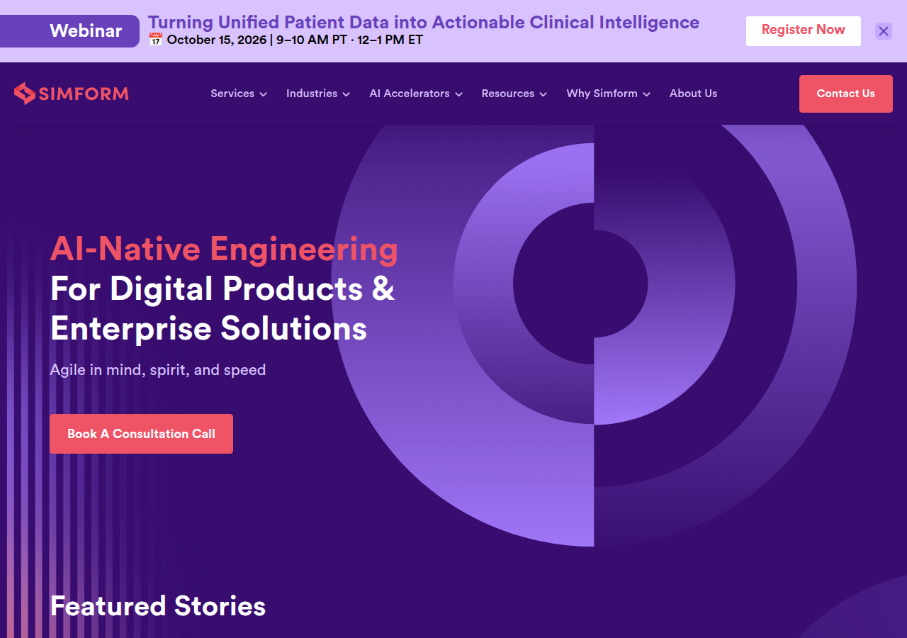
Coloured keyword lead-in ('AI-Native Engineering') with one 'Book A Consultation Call' button: clear service category + action.
Open research screenshot ↗